
Introduction
I always admire people who create single-div illustrations in CSS. One div, multiple background layers, tone of CSS code and BOOM. Here you have an illustration. I always thought that it must be challenging, and I would never create such a thing. I was wrong. 😱
To create a simple image, you need to know only one thing: how backgrounds in CSS works. that’s it. Really! You don’t have to use CSS variables. They help to maintain clean code. it’s much easier to read those images with variables, but it’s not required.
Exercise no. 1 - most simple illustration
let’s start with something straightforward. If you understand this example, you will be ready to go. 💪
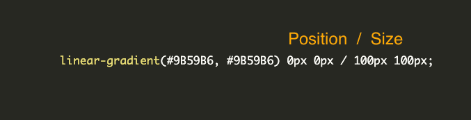
<div></div>Okay, what we have here? 100x100px rectangle with linear-gradient starting and ending with the same colour. Our first background has also defined background-position: 0px 0px; - on X-axis and 0px on Y-axis. It means that our background starts on the top-left corner... Then we have background-size: 100px 100px; which obviously defines the size of our purple colour. And the last one background-repeat: no-repeat; to prevent replying our layers.
Conclusion:
- our div is solid #9B59B6 colour because we start and end gradient with the same colour
- It is 100x100px
Great, let’s move on and add one more layer.
<div></div>And that’s it! We have two linear-gradient layers on each other. Pay attention to layer order! Earlier layers are on top of the others. Think about it as a z-index.
I don’t like having properties broken into pieces, so let’s clean up a bit.
div {
   width: 100px;
   height: 100px;
   background:
     linear-gradient(#fff, #fff) 35px 35px / 30px 30px,
     linear-gradient(#9B59B6, #9B59B6) 0px 0px / 100px 100px;
   background-repeat: no-repeat;
 }
The forward slash separates background-position values and background-size values. The formal syntax requires the slash.
If we have more background layers, things might be a little bit messy. You probably won’t remember if the line 31 of the background goes for window or maybe for a fence. 😄
div {
   --white-square: linear-gradient(#fff, #fff) 35px 35px / 30px 30px;
   --purple-square: linear-gradient(#9B59B6, #9B59B6) 0px 0px / 100px 100px;
   width: 100px;
   height: 100px;
   background:
     var(--white-square),
     var(--purple-square);
   background-repeat: no-repeat;
 }
This is much cleaner!
Exercise no. 2 - small house
You already know enough to create illustrations. To warm up before the final exercise, let’s make a small house.
We need there a few layers:
- house front
- door
- roof left part
- roof right part
- window one and window two
<div></div>Triangles
The most challenging part of this house is to create triangles. let’s split this code into pieces.
let’s work on this example:
<div></div>Our goal is to create a triangle for our roof. Currently, our gradient has a 0deg angle, so let’s change it. I would like to have a small roof slope angle, so I changed it to 12deg.
<div></div>I think you got it and you know what you should do now. 😉 let’s decrease the percentage of the gradient. I changed it to 19degs to have a perfect starting point on the right side.
<div></div>Lastly, we need to replace the red background with a transparent one.
<div></div>And here we have a nice roof with a right angle. 🚀
A Complex Example of the House
I like throwing myself into the deep end. that’s why I created detailed house as my first one single-div image:
It looks like a complex example. But if you create the previous one, you will be able to make identical as above. The only difference between my samples in the article and this one are units. Here i’m using the `vmin` unit to create a responsive image.
that’s all for today. Thanks for reading! If you have any questions, feel free to DM me on Twitter - @albertwalicki