Introduction
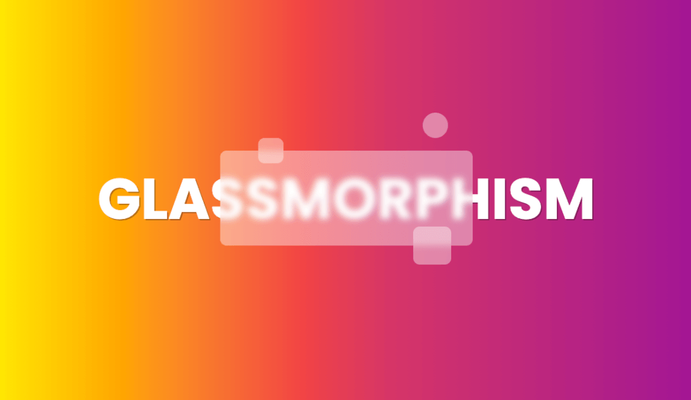
Last year Neumorphism trend was horrible and awful. In 2020 I expected something even worse, but Michał Malewicz, the creator of Neumorphism style, wrote about something fresh and good looking - Glassmorphism style.
let’s take a look at it.
New trend
Glassmorphism is a new trend which is getting more popular on services like Dribbble or Behance.
it’s characteristic features are:
- transparency (frosted-glass)
- vivid or pastel colours
- light border
Glassmorphism - the CSS way
Glassmorphism pretty easy to achieve for frontend developers. There is one main CSS property which we can use - backdrop-filter. This property allows you to apply multiple effects such as blur, sepia, greyscale to the area behind your component. Since it applies to everything behind the component, to see the effect, you must make this element to be at least partially transparent.
To create glassmorphism effect you should use backdrop-filter: blur().
<div class="basic">
  <div class="blur"></div>
</div>The image behind has straight background: rgba(255,255,255,0.4). The element above is a copy of the first one but with additional backdrop-filter: blur(10px) property.
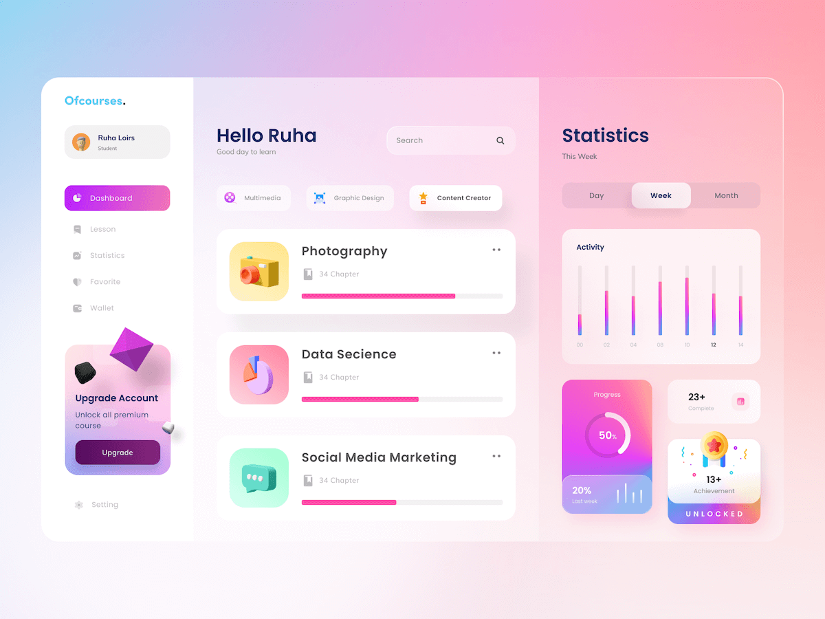
This is the simplest example of a new trend. But we can go even further. You can add recomended by Michał Malewicz border-radius, white border and little bit more blur.
The last thing you can try is to add a 1p inner border with some transparency to your shape. It simulates the glass-edge and can make the shape stand out more from the background.
<div class="basic">
  <div class="blur"></div>
</div>Glassmorphism 2021
I hope that glassmorphism will be trendy in 2021. I would like to see real apps built in this style or have a chance to build them on my own.
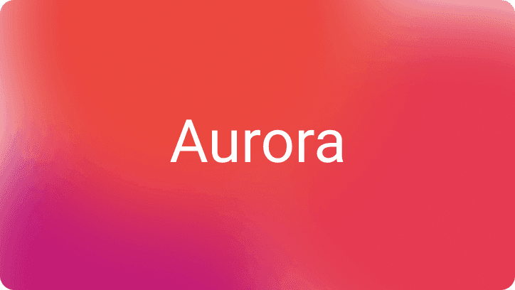
Play with my hero image on codepen.
Browser compatibility
Property backdrop-filter according to Can I Use is fully supported by Chrome, Safari, iOS, Android Browser and Edge. Firefox is not supported by default but can be enabled.