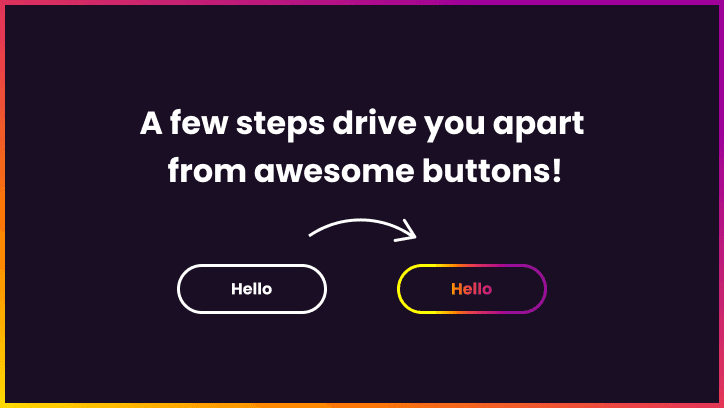
Most buttons are boring. Solid, standard borders, most of them are not aligned correctly. In this case, let’s learn how to create a gradient colour button with animated borders and text! One single CSS property will handle all animations.
In the first place, let’s start with a basic outline button with hover can be created like this:
<a href="/" title="Hello button" class="btn">Hello</a>
.btn {
  border: 2px solid #4CAF50;
  background-color: transparent;
  color: #4CAF50;
  padding: 10px 28px;
  font-size: var(--f-m);
  cursor: pointer;
  transition: 256ms all;
  border-radius: 20px;
}

.btn:hover {
  background-color: #4CAF50;
  color: #fff;
}
Gradient button and text
One step further - adding gradient borders and text.
To achieve that, we need to do a few things:
- Wrap our button with div and set the background as our body colour
- Add pseudoelements to create borders
- Lastly, we need to add three CSS properties:
<a class="btn" href="/" title="Hello">Hello</a>
.btn {
  display: block;
  width: 150px;
  background: linear-gradient(90deg, #FFFF00 6%, #FFA500 25%, #F14444 45%, #D53567 55%, #9A109A 94%);
  text-align: center;
  padding: 13px 20px;
  color: #fff;
  background-clip: text;
  -webkit-background-clip: text;
  -webkit-text-fill-color: rgba(255,255,255,0.001);
  transition: 256ms all;
  position: relative;
  cursor: pointer;
}

.btn:before {
  background: rgb(24,24,24);
  content: '';
  position: absolute;
  top: 0px;
  bottom: 0px;
  left: 0px;
  right: 0px;
  z-index: -1;
}

.btn:after {
  content: '';
  position: absolute;
  top: -1px;
  bottom: -1px;
  left: -1px;
  right: -1px;
  background: linear-gradient(90deg, #FFFF00 6%, #FFA500 25%, #F14444 45%, #D53567 55%, #9A109A 94%);
  transition: 256ms all;
  z-index: -1;
}
Awesome! You have created a gradient border button with gradient text! Now we will bring it to life with extra CSS.
In CSS we can’t transition gradients. It would be awesome to see smooth animation with CSS like this:
.gradient {
  background-image: linear-gradient(red, blue);
  transition: background-image 0.5s linear;
}

.gradient:hover {
  background-image: linear-gradient(green, orange);
}
But it won’t work. It immediately changes to the other one without transition. There are a few hacks to do it, but my favourite is to animate background-position.
Firstly, we need to add two properties to our button:
- background-size: 200% auto;
- background-position: left center;
Then on hover:
- background-position: right center;
In this case, I added a gradient starting with white colour. It enhances the impression of an animated border.
<a class="btn" href="/" title="Hello">Hello</a>
.btn {
  display: block;
  width: 150px;
  background: linear-gradient(90deg,#ffffff 3%,#ffffff 47%,#FFFF00 53%,#FFA500 72%,#F14444 77%,#D53567 88%,#9A109A 97%);
  background-size: 200% 100%;
  background-position: left center;
  text-align: center;
  padding: 13px 20px;
  color: #fff;
  background-clip: text;
  -webkit-background-clip: text;
  -webkit-text-fill-color: rgba(255,255,255,0.001);
  transition: 256ms all;
  position: relative;
  cursor: pointer;
}

.btn:before {
  content: '';
  position: absolute;
  top: -1px;
  bottom: -1px;
  left: -1px;
  right: -1px;
  background: linear-gradient(90deg,#ffffff 3%,#ffffff 47%,#FFFF00 53%,#FFA500 72%,#F14444 77%,#D53567 88%,#9A109A 97%);
  transition: 256ms all;
  z-index: -1;
  background-size: 200% 100%;
  background-position: left center;
}

.btn:after {
  background: rgb(24,24,24);
  content: '';
  position: absolute;
  top: 0px;
  bottom: 0px;
  left: 0px;
  right: 0px;
  z-index: -1;
}

.btn,
.btn:before {
  background-position: right center;
}
And that’s it!
You can play with the final button Here.